Three Column Chat
A chat with this layout can accommodate the largest number of components. Since the first and second columns adapt to the width of their content, striving for a minimum, it makes sense to place various additional components in them. The remaining third column can accommodate the main chat component.
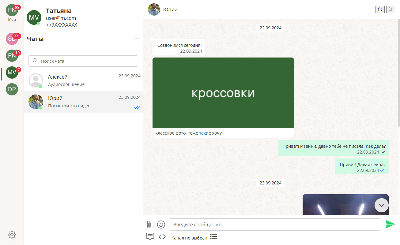
In the example below:
- the first column contains a SideBar with buttons for quick access to chats (other options are possible);
at the bottom ThemeMode - selector for choosing a customizable chat theme - the second column contains a UserProfile block with main information about the current user;
the remaining space is occupied by the chat list ChatList, including search among chats - the third column contains the chat information block ChatInfo;
chat body with messages Feed;
message input field ChatInput;
various button objects with additional actions (file upload, emoji selection, template usage, communication channel selection).
Code Structure of Typical Chat in Extended Layout
vue
<template>
  <BaseContainer>
    <ExtendedLayout>

      <template #first-col>
        <SideBar />
        <ThemeMode />
      </template>

      <template #second-col>
        <UserProfile />
        <ChatList />
        <!--Search can be placed in the second column-->
        <FeedSearch />
        <FeedFoundObjects/>
      </template>

      <template #third-col>
        <chat-wrapper >

          <template #default>
            <ChatInfo>
              <template #actions>
                <!--Your triggers for various events-->
              </template>
            </ChatInfo>
            <!--Search can also be placed in the third column-->
            <FeedSearch />
            <FeedFoundObjects />
            <Feed />
            <ChatInput >
              <template #buttons>
                <FileUploader />
                <ButtonEmojiPicker />
                <ButtonTemplateSelector />
                <ButtonWabaTemplateSelector />
                <ChannelSelector />
                <!--Additional elements possible-->
              </template>
            </ChatInput>
          </template>

          <template #chatpanel>
            <ChatPanel>
              <template #content>
                <!--Your content in the side panel-->
              </template>
            </ChatPanel>
          </template>

        </chat-wrapper>
      </template>

    </ExtendedLayout>
  </BaseContainer>
</template>